The Cranky Typographer's
10 Tons of FREE Graphics Tips
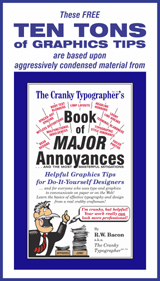
The following 10 FREE Graphics Tips are more accurately "The 10 FREE Insights into Essential Categories of Knowledge for the Neophyte Graphic Designer." But of course that would not fit into the navigation menu at the left, and the ponderous language would drive away those who need the advice most. The 10 FREE Tips --- or "Insights" --- are adapted, paraphrased and aggressively condensed from The Cranky Typographer's Book of Major Annoyances: Helpful Graphics Tips for Do-It-Yourself Designers, by Reginald W. Bacon. (Yes, you can BUY the book here.) The knowledge presented here does not pretend to include all of the collected wisdom on the subject of typography and design. Further, the Web cannot yet render typography that illustrates all of the principles. Nevertheless, by devoting some thought and study to these 10 categories of knowledge, you'll see aspects of your finished product improve straightaway. Go forth with gusto! With your new insights on the effective and functional use of type, you'll help avert the decline of civilization!
The 10 FREE Graphics Tips
(... OK, "Insights"):
Take time to grasp the basics:
(1) Understand the role of graphic design.
(2) Make type & image work together.
Aim for functional typography:
(3) Learn body text basics & readability.
(4) Learn display text basics & legibility.
(5) Apply consistent typographic style.
(6) Choose appropriate typefaces.
Integrate type & image:
(7) Learn photo cropping & positioning.
(8) Learn to use lines-of-force.
(9) Execute the layout with precision.
(10) Prepare trouble-free production files.
Below is expanded information on each category, shared in generous spirit, with the hope that it improves the appearance, effectiveness, and communicative function of your do-it-yourself projects. And of course if you find the information helpful, and if you ever start to feel like a deadbeat, yes, you can BUY the book here!
Take time to grasp the basics:
(1) Understand the role of graphic design.
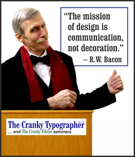
What is graphic design? Graphic design is nothing more --- and nothing less --- than using type and image to give tangible shape to thoughts and ideas. The attentive designer controls the visual signals with precision and nuance, so that the look of a publication, page, logo/identity, or website reinforces its content. The mission of graphic design is to enhance communication, to catapult ideas from the page into the reader's brain, not simply to "dress up."
This should be obvious, but just in case it isn't: Graphic design is driven by the content of the message, whether it is monumental or mundane. If you, your boss, or your client has not formulated a clear message ... or articulated a need ... or has no mission ... or has nothing to say ... then there are no ideas to shape into tangible form. Refine the ideas and content first. Give the designer (you?) something to work with!
Why is graphic design important to you, your business, or your organization? Whatever your line of work --- curing the world's ills, promoting big ideas, selling widgets, exacerbating the world's ills, or painting toenails --- graphic design is important to you because all of your printed materials, online pages, and premises signs --- from your everyday letterhead to your comprehensive website --- combine to represent you, your organization, your professional credibility, and your level of quality and service, when you're not present to make that positive impression in person.
Where does graphic design start? News flash: Graphic design starts in your brain, as you cogitate to arrive at a clear conception of what you want to accomplish and who you are trying to reach. Walk away from your computer and commandeer a pencil, a piece of paper, and your brain. A clear idea of goals and audience for your project will determine how you approach the design for maximum effectiveness. Real graphic design is not the last-minute application of decorative window dressing, but rather an integral component of communicative function to be planned with care from the outset.
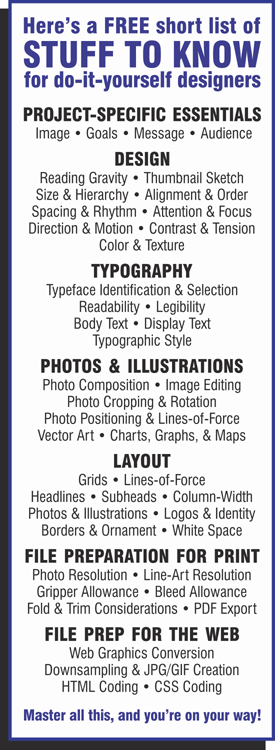
How does a real designer do it? News flash: Graphic design is not all about mad mouse-clicking and staring at the computer screen. Graphic design is done in your brain based on real accumulated knowledge. That knowledge will include: (a) understanding of project goals & audience; (b) understanding of the content; (c) knowledge of reading gravity & typography; (d) understanding of the designer's "conceptual tools" of design: size & hierarchy, alignment & order, spacing & rhythm, attention & focus, direction & motion, contrast & tension, and color & texture; and (e) understanding of and facility with using the "building blocks" of design: display type, body type, photos & illustrations, logos & identity materials, borders & ornaments; and white space. A professional designer, using experience and facility with the "conceptual tools" and the "building blocks," arrives at one or more roughly-sketched designs appropriate to the content and audience, and then makes a more accurate proportional "thumbnail sketch" which becomes the guide from which to execute the actual "layout." All of this is clearly explained in greater detail for the "designer-by-default" in The Cranky Typographer's Book of Major Annoyances: Helpful Graphics Tips for Do-It-Yourself Designers, by Reginald W. Bacon. (Yes, you can BUY the book here.)
How is a design finished? OK, this is when the grunt-work at the computer comes into play. Referencing the thumbnail sketch of the design as a guide, the designer uses the appropriate professional graphics software applications (translation: not the crummy office-grade software best used for shopping lists and lost cat notices) and their precision alignment tools to position all the "building blocks" and execute the final layout. In the case of print graphics projects, the digital file of the final layout is then converted with care from the proprietary graphics file format to the industry-standard PDF format for reliable and efficient production. So that's how it's done. (At best, the design of a completed project that is perfectly-matched to its goals and audience should be transparent to the layperson, appearing to be seamless and effortless.)
Now, with this understanding as a foundation, we move onto more concrete tips that will improve the look and function of your do-it-yourself designs immediately.
(2) Make type & image work together.
In functional graphic design, words and images should work together. The content of the text should drive the design. The mood, atmosphere, photos, illustrations, ornament should reinforce the text content. This principle seems like obvious common sense, but it is often ignored, even by professionals. That's because it is so easy to become intoxicated with colors, shapes, swooshes, and swashes. The art-drunk designer then coddles and tweaks the design, which may be ill-considered in the first place, to the point that the text content is relegated to afterthought status. As a very general observation, graphic designers that come from a fine arts background tend to place more emphasis on color, shape, and form than on text readability; while graphic designers from an editorial or content background tend to place more emphasis on readability and ensuring that the tone of the design suits the content. To be sure, both art elements and text communicate. But in any given design, type and image should reinforce each other in a transparent way to convey the meaning in the content.
Aim for functional typography:
(3) Learn body text basics & readability.
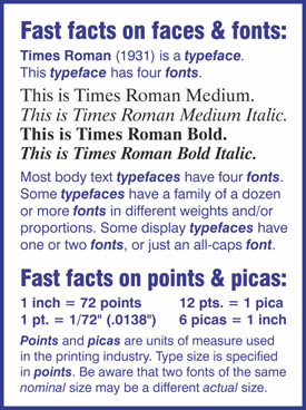
What is body text? Body text or "body type" is the name for the smaller text (generally 12 pt. and under) set in blocks or columns, that contains the detailed content in print or online. This category of type, as seen in books, magazines, newspapers, advertisements, and on websites, is distinguished from larger size "display type" which serves a display or headline function.
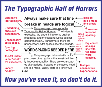
Aim for optimal readability. The goal in setting specifications for body text is to achieve optimal readability and comprehension. Readability refers to the measurable speed, ease, and comprehension of blocks of running text. Variables that affect readability are typeface choice, type size, column-width, characters-per-line, inter-line spacing (leading), tracking (word-spacing and character-spacing), alignment, hyphenation, and white space.
Readability and comprehension studies. Reliable studies of readability and comprehension have taken much of the guesswork out of typographic composition. (Unfortunately, these studies are difficult to discover for the layperson, and more unexplainably, remain buried like lost secrets even to many newly-minted graphic design professionals.) Studies directed by Colin Wheildon verified the findings of our mentor-in-common, Edmund C. Arnold. Wheildon's results and methodology are in his essential book, Type & Layout: How Typography & Design Can Get Your Message Across --- or Get in the Way, and are referenced in The Cranky Typographer's Book of Major Annoyances: Helpful Graphics Tips for Do-It-Yourself Designers, by Reginald W. Bacon. (Yes, you can BUY the book here.) Readability and comprehension are greatly influenced by how we learn to read. And of course, reading itself is in a state of flux, as today we read on glowing screens, tiny phones, and on streaming digital signs, as well as continuing to read old-school newspapers and books. Therefore be aware of the changes in how children learn to read, and keep up with the latest findings in readability.
Below are some safe parameters for each of the variables, all based on quantifiable studies of readability. The challenges of individual projects will always call for adjustment of the variables to achieve the best possible result. What follows is a "body type survival guide" for the do-it-yourself designer:
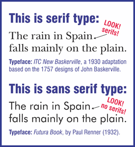
Typeface choice for body type: Serif or sans serif? It depends. Context dictates. In the U.S., generations of people learned to read from books typeset in Century Schoolbook, a serif typeface. For large masses of text, such as in books or magazines, a serif typeface for body text is the "comfort zone" for sustained readability, and that has been verified in controlled studies. In some European countries, recent generations have learned to read from books set in sans serif typefaces, and thus have a different "comfort zone" --- and studies show different readability results. For websites on-screen, sans serif typefaces are much more readable, as current digital displays do a poor job of rendering serif detail. For the newest generation of readers, the serif vs. sans serif argument may prove to be a toss-up.
Body type size. Body type set between 10-to-12 pt. yields the highest readability and comprehension, and the lowest reader fatigue.
Column-width, i.e. characters-per-line. Optimal line-length for blocks of body type is between 40- and 60-characters per line, ranging slightly higher for books, and slightly lower for newspapers or advertising materials.
Inter-line spacing (leading). Optimal leading for 10-12 pt. type is 2 pts., slightly less for narrow columns, and slightly more for wider columns.
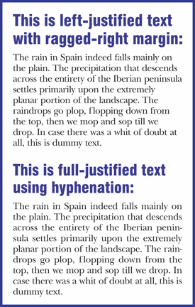
Body type alignment: Full-justified or ragged-right? Both alignments are useful and have their most suitable applications. In both alignments, the eye bounces back to fixed axis of orientation at the left margin. Readability studies show that full-justified body text is preferred for sustained reading of large masses of text, as in books or magazines. The advantage for left-aligned, ragged right text is that it avoids the need for hyphenation.
Hyphenation ... or not? Hyphenation of full-justified body text avoids uneven and distracting word-spacing. Usually no hyphenation --- or just discretionary hyphenation --- is needed for left-aligned, ragged-right body text. Be vigilant for stupid automatic hyphenations like the-rapist or arse-nal.
White space. Ample white space (or "negative space") enhances readability. Make sure the margins are wider than the gutters. Don't crowd your body text. This "Whitey" is your friend. He won't kill you.
What about widows, orphans, flitjays, rivers, margins, gutters, and paragraphs in reverse, color, boldface, or all-caps? Yes, there is plenty more to know. (Yes, you can BUY the book here.)
(4) Learn display text basics & legibility.
What is display type? Display type is the category of type distinguished by size and function from the smaller 10-12 pt. body type. Generally, bold type in sizes of 14 pt. and above is regarded as display type. The functions of display type include attracting reader attention, drawing the reader into the body text, providing "entry points" for the casual reader, or directing the reader to the call-to-action. For such functions, it is the legibility of display type that is more important than readability. Legibility in this usage refers to the quick and easy perception of letterforms and words. Supporting the function of display type is adherence to a consistent hierarchy of type sizes, i.e. fixed levels of headline and subhead sizes that help the reader stay on track throughout a single-page or multi-page document. Legibility studies indicate that headlines set flush-left/ragged-right, and in "downstyle" sentence case (as in the two-line head "Jackson awarded / honorary degree") are the most immediately comprehensible. What follows are the variables of display type composition:
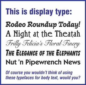
Display type choice. All typefaces are not created equal. Some typefaces rate as highly readable, while others are quite legible but not very readable at all. Many decorative and ornamental typefaces were designed specifically for display-size use in logos and custom headlines. They may be neither legible nor readable, but their distinctive personality, whether elegant, informal, thematic, or wacky, can serve a communicative function. For text-heavy projects like books, journals, course catalogs, and newsletters, the display type serves a wayfinding role. The body text content is paramount, and ideally the display heads and subheads should be complementary and transparent without being boring. A conservative but reliable combination is to use a sans serif typeface for heads and subheads when using a serif typeface for the body text. Conversely, if using a sans serif for the body text, consider a contrasting serif face for the heads and subheads. More information on typeface choice is in category #6, "Choose Appropriate Tyepfaces."
Display type size & hierarchy of sizes. There is no one-size-fits-all recommendation for headline size, as the size determination is always based on context. Content-focused publications such as newsletters and catalogs require more discipline, while advertising and promotional materials allow for more personality. More important than size is maintaining a consistent relationship of type sizes. Consistent size relationship of headlines and levels of subheads helps the reader quickly grasp the organization of the layout. In headlines and subheads, typographic consistency also extends to weight, alignment, spacing, and color.
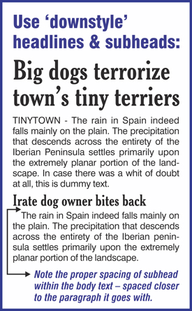
"Downstyle" headlines or all-caps? For optimal comprehension, use left-aligned "downstyle" sentence-case headlines (as in this two-line example: "Our new scaffolding / scores with bricklayers"). Left-aligned sentence-case headlines, if well-written, are more instantly perceived and understood than centered or all-caps headlines. Regarding all-caps versus downstyle headlines: Many old-time editors even in the late 20th century believed that all-caps gave their headlines greater emphasis. But readers perceive whole words, discerning the shapes from combinations of ascending and descending characters. All-caps lines of type present the reader with words not as recognizable shapes, but as a series of rectangles. Therefore, for content-heavy publications, using downstyle headlines is the logical course, given the physiology of reading.

Letterspacing in display type. In larger display type sizes, certain irregularities in letterfit may become so noticeable that they demand attention. Individual words or headlines set in large all-caps almost always need letterspacing adjustment. Not so long ago, masters of the craft regarded un-letterspaced headlines as sloppy, unfinished work. The problematic letter combinations occur when capitals like A, F, L, P, T, V, W, and Y come up against other letters that, because of their own shape, appear to be too close or too distant. When such irregularities are followed by a series of vertical letters like E, H, I, M, and N, the odd spacing can stand out even to the layman. The goal of letterspacing is to render any problematic words in display type as optically evenly-spaced as possible. Today letterspacing is accomplished using eye-and-brain judgment, along with the aid of graphics software that allows both click-and-drag as well as numerical adjustments. A good all-caps word to practice on at large size is AVAILABLE. After you practice on this word, you'll never fail to notice how dumb it looks, unspaced, on all those real estate signs.
Display type alignment. If you want your display type headlines to be read, use flush-left alignment and place the head at the top of the page. Studies of display type position indicate that headlines in designs that deliberately break with reading gravity have less than half the comprehension level of those designs that follow reading gravity. Certainly the subject matter, design, content, photos, and other graphic elements can combine to make a case for other alignments and positions for display headlines. Centered headlines have their place. Flush-right headlines work just fine when combined with an engaging photo or illustration that has the right lines of force. Just know that the headline studies have found that maintaining a consistent left-margin axis-of-orientation yields the best readability, and the best draw into the body text.
Display type spacing. Use consistent spacing to create visual groupings that give readers a clear sense of structure between head and subhead, and subhead and body. For example, in a column of running body text broken by a display text subhead, pay attention to the spacing subtlety. The subhead should be closer to the paragraph it goes with than the preceding paragraph. The spacing should not be equal. More white space goes above the headline than below. Maintaining consistency of space relationships throughout a publication is paramount. The hierarchy of type-sizes you develop for your design should also include standards of consistent spacing for each type size used. If in less formal projects the design calls for a departure from established consistency, be bold about it. Make it obvious and don't be a wimp.
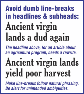
Line-breaks in display type. Stupid line-breaks in headlines rank among the most common bonehead blunders in typographic design. Clumsy line-breaks in headlines slow down comprehension, and sometimes convey unintended meaning. Break multiple-line headlines according to logical phrasing, or according to the natural pause in speech.
Give headlines the "So What" test. Headline studies indicate that half of prospective readers never even make it into the body text if they are not engaged by the headline. The reader quickly derives the essence of page content from the headline and subheads. If the reader glances at a bland headline for a second and says "So what?" and moves on, the rest of your sparkling body text never gets read. Always give headlines the "so what" test. Be boring at your own risk.
Display type color. Color in display type, when used wisely, can help guide the reader through a page. Color can also be distracting, confusing, and malfunctional. A truism in design: If a page design does not work in black, color alone won't save it. Functional color is frequently used in publications for organizational reinforcement (wayfinding, etc.), but functional color use may also encompass identity reinforcement or narrative reinforcement. If you use color, make it serve the content, don't just decorate the paper.
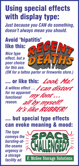
Special effects & display type distortion. Today's graphics software makes it easier than ever to indulge in custom typographic effects such as shadows, fades, color blends, and overeducated graduated screens for display type. The ease in creating such effects when appropriate to serve a function is welcome. The overindulgence in such effects, not because they suit the message, but just because they are possible, is not welcome. Special typographic effects that do nothing to reinforce the message are nothing but malfunctional clutter.
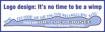
Display type for logo & identity graphics. Toss out the rules here, because it's a free-for-all in comparison to the realm of functional typography. The subject of logo development and identity graphics is an areas of study unto itself. If you are the do-it-yourself logo designer for your business, remember that your logo and identity materials represent you, the credibility of the business, and the quality of its services. Logo design decisions should not be taken lightly or rushed into by cobbling together an off-the-shelf logo from an online vendor. Consider a consultation with a professional.
(5) Apply consistent typographic style.
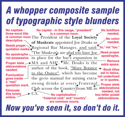
Typographic style: What is it? Editing for typographic style consistency is within the editorial phase that lies midway between the craft of writing and the craft of type composition. The phrase "typographic style" tends to misdirect, and leads the layman to believe it has something to do with aesthetics, typeface choices, or decorative effects. "Typographic style" is actually much more mundane, but it is essential in the preparation of a professional publication. Applying typographic style to body-text is to apply proper and consistent capitalization, punctuation, abbreviation, and spacing; and proper and consistent use of italics, subscript, superscipt, and small caps --- all guided by standards set forth in a "stylebook." (What's a "stylebook"? See the sidebar at the right.)
The basics of applying consistent typographic style are included in The Cranky Typographer's Book of Major Annoyances: Helpful Graphics Tips for Do-It-Yourself Designers. (Yes, you can BUY the book here.) Professional typographic style includes applying conventions like using just one space after a period; using proper "curly" quotation marks and apostrophes instead of inch- and foot-marks; never underlining body text; proper use of italics; proper use of punctuation marks; proper use of abbreviations, initialisms, & acronyms; proper use of state abbreviations in running text instead of two-letter postal abbreviations; proper capitalization; proper spelling of place names and geographic features; and enforcement of any in-house departures from the stylebook of choice. (Unfortunately many of these conventions are lost on the Web, where typographic control remains in its infancy. But conditions will improve.) The goal of typographic style is consistency throughout a publication, so it doesn't look like it was typed by an orangutan. Indeed, consistency in our language, even though it is a relatively newfangled notion, and even though our language is always evolving, is what makes clear communication possible.
(6) Choose appropriate typefaces.
Choose typefaces appropriate for the subject. Choosing typefaces is not unlike getting dressed in the morning. Where you're going, who you're likely to meet, and what you're trying to accomplish influence whether you start your day in overalls, a business suit, or shorts and a T-shirt. In a similar way, the reading audience and the goals of your printed piece will influence your choice of typefaces. Once again, not all typefaces are created equal. Some typefaces are more versatile than others, have a large family of fonts in different weights, and work well in a variety of settings and sizes. Most display typefaces were designed for use in short headlines only, and are unreadable when used in running text. Some ornamental typefaces exist only in the uppercase alphabet. Calligraphic typefaces might look pretentiously elegant for a few lines on a formal invitation, but a full paragraph will be almost unintelligible. The do-it-yourselfer's word to remember in typography is "restraint." Just because you have access to a thousand typefaces on your system, you don't have to use them all on very project. Choose one or two complementary or contrasting typefaces (and their family of font styles) for your project.
Choosing typefaces for personality, versatility, readability, credibility, identity, or compatability. Any one of these reasons is a valid justification for choosing typefaces for a particular project. Sometimes personality is the overriding factor, and sometimes the versatility of the typeface family is most important. Recommended typeface combinations for different categories of projects are included in The Cranky Typographer's Book of Major Annoyances: Helpful Graphics Tips for Do-It-Yourself Designers. (Yes, you can BUY the book here.)
Typeface cautions for the neophyte: Don't use two different serif typefaces on the same page. Don't use two different sans serif faces on the same page, unless you make it obvious by size, color, or function. Never use the display typefaces bundled with office-grade software for body text. Don't set an entire paragraph of unreadable loopy-looped-and-frilly script. Don't use thematic typefaces for body text --- they're for short headlines only. Don't catch hipatitis. Avoid the typographic fad-of-the-month. Don't be a wimp. Don't be reckless, either.
Integrate type & image:
(7) Learn photo cropping & positioning.
Choose and use the photos and illustrations with the utmost care, as they are powerful building blocks of design. A good photo can tell a gripping story, with motion, emotion, depth, and contrast --- or simply augment the text in a useful but perfunctory way. Coversely, a bad photo --- poorly composed, cropped, or oriented --- can also misdirect the reader/viewer and sabotage communicative function. The primary variables in choosing and using photos in a design and layout are relevance, composition, size and proportion, lines-of-force, and cropping and rotation. These variables, with many examples, are discussed in greater detail in The Cranky Typographer's Book of Major Annoyances: Helpful Graphics Tips for Do-It-Yourself Designers. (Yes, you can BUY the book here.)
Photo relevance. In some projects, photos are chosen to illustrate specific text content. In others, a photo might be chosen because it is an attention-grabbing context image that is symbolic or suggestive of the topic or theme.
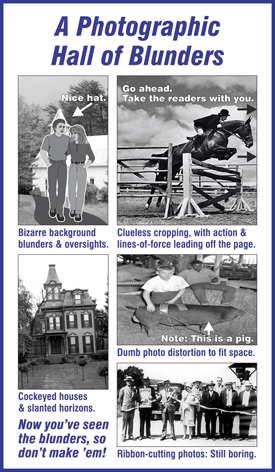
Photo composition. Elements of composition include expression, emotion, stillness, motion, lightness/darkness, color, contrast, background, foreground, and proportion. With the ease and economy of today's digital photography, there is almost no excuse for settling for a photo of inferior image quality, bland composition, or distracting background. Study the examples from the Hall of Blunders, and then make sure you don't repeat them. Look for photo compositions that exhibit either motion or direction, out-of-the-ordinary perspectives, or real human expressions. Regarding proportion: As a general rule for the beginner, photos become more interesting to the viewer and more useful in a layout the further away the proportion departs from that of a perfect square. Don't settle for boring and lifeless photos. Go for the dramatic proportions whenever possible. Regarding bland subjects: Often tired and boring cliche photos are thrust upon a project, such as the "grip-and-grin" plaque presentation, or the lineup of flabby ribbon-cutters. Avoid them. Lose them. Whatever it takes.
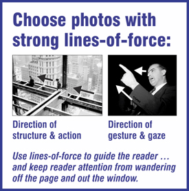
Lines-of-force in photos. Select photos with lines-of-force that are best suited to the particular design and layout. The best photos have strong lines-of-force, i.e. a shape, color, angle, or action that directs the eye. Obvious examples of lines-of-force are a little boy pointing insistently at an ice cream truck ... or a javelin-thrower at the total-effort point of release ... or a couple gazing up at the moon. An effective design employs lines-of-force in photos to contain the reader/viewer within the page layout, or direct the reader/viewer through the page or spread, reinforcing the principle of reading gravity. A common amateur design blunder is the placement of a photo so that its line-of-force directs the eye of the reader off the page and out the window.
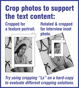
Photo cropping & rotation. Skilled cropping can make an ordinary photo come alive. Sometimes all it takes is cropping tightly to an extreme horizontal or vertical proportion. In fact, the same photo cropped differently can tell an entirely different story, impart a different feeling, or suggest a different image. When taking a photo, always leave yourself ample room for cropping. Rotate the photo before cropping, if necessary, to level the horizon, or plumb vertical lines like doors or windows. Crop tightly and purposefully. Crop to showcase the "story" in the photograph that reinforces the text content.
(8) Learn to use lines-of-force.
Lines of force in design: Make "reading gravity" work for you. Readers of the English language learn to read from left-to-right. Those who learned to read from words on printed pages learned to habitually start at the upper left of a page, and depending on the layout or illustrations, directly or indirectly make their way to the lower right of a page.
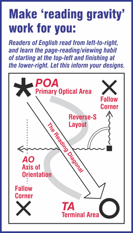
This "reading gravity" is based on the study of both the physiology of reading and the learned habits of readers. Thus, the "reading diagonal" is like a line-of-force on the page (or two-page spread) even before the designer begins. Therefore the attentive designer employs "optical magnets" and lines-of-force to carefully guide the reader to discover secondary and tertiary elements in the fallow areas off the reading diagonal. A functionally effective design guides readers, orchestrates them, and direct them --- by acknowledging and using reading gravity. Photos, illustrations, lines of display type, columns of body type, white space, and ornament can all be utilized at one time or another as lines of force to orchestrate attention and focus in service to the communicative function.
Guide the reader with attention ... and focus. Every page or spread should have a primary focal point that attracts the reader/viewer. That focal point could be a photo, a design, or simply a headline. The primary focal point usually combines with lines-of-force or motion to direct the reader to the starting point from which to follow the natural reading gravity.
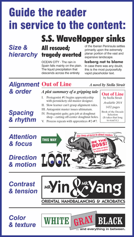
Guide the reader with direction ... and motion. The invisible lines-of-force, motion, and direction in a design serve to direct and guide the reader/viewer through the layout in a logical manner. The goal of such invisible direction, of course, is the optimal comprehension of the mood, attitude, message, and concrete information put forth on the page. Lines of force in photos and graphics, when properly oriented, also serve to redirect wandering readers back onto the page.
Guide the reader with contrast ... and tension. Despite all the emphasis on alignment and consistency in graphic design, it is the carefully orchestrated contrast and tension overlaying that consistency that creates interest on a page or spread. Contrast as a graphic tool includes more than just the character of the dominant visual, and more than just bold vs. light type, or large vs. small graphics. Consider also the contrast of horizontal vs. vertical photos, dark vs. light colors, loose vs. tight spacing, image elements vs. text elements, aligned elements vs. a random angled element, or a monotonal typeface vs. a nut-fringe display face. Regarding the introduction of tension, a design, just like a captivating piece of music, benefits from a pattern of tension and release.
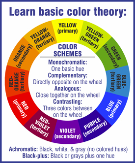
Guide the reader with color ... and texture. Color is powerful, evocative, and suggestive. Color photos can be brilliant and breathtaking. Color in display type, when used wisely, can help guide the reader through a page. Color can also be distracting, confusing, and malfunctional. If you use color, make it work for you, just don't decorate the paper. The functional use of a color is usually more important than its particular hue. For printing projects, the paper that carries the design is an important variable, as the background color and texture affects the rendering of type elements and photos. Essential to understanding color theory is the "color wheel," which is a circular diagram of logically arranged colors. Using a three-part color wheel, the designer can make intelligent choices about analogous colors (side-by-side on the wheel), complementary colors (directly opposite on the wheel), or contrasting colors (three colors between them on the wheel). For the neophyte, it is safer to use the color wheel rather than rely only on personal likes and dislikes to come up with color combinations. Once again, "restraint" is the watchword for the do-it-yourself designer.
How do you learn all this stuff? Find a master mentor and latch on. If you can't find one near you, or if they're all dead, you can BUY the book here.
(9) Execute the layout with precision.
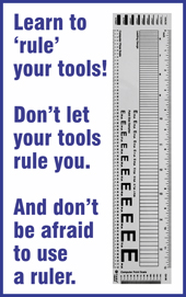
Build your layout as a cohesive whole. Now it's time build your final layout from your thumbnail sketch design, using your chosen building blocks (headlines, subheads, body text, photos, illustrations, white space, and ornaments). Your aim is to arrange these graphic elements so they work together, creating visual linkage of elements through alignment, contact, contrast, color, or lines-of-force. The ideal result is a layout that brings the design to its functional life of catapulting ideas from the page into the mind of readers. At this 11th hour, you sure don't want to bungle the final product with sloppy craftsmanship, so you must vow to "rule" your craft. That is, use your old-school ruler and the ruling lines of your layout software to maintain consistency of alignment and spacing. When you execute a layout based on your design, that final layout brings together all the principles and best-practices of the craft, including adherence to the principle of reading gravity. You'll be using all the placement and measuring features in your quality graphics software application to achieve the precision alignment and consistent spacing that reflect a seamless, professional, effective, and reader-friendly finished product.
By the way, what about the software? It would be limiting to recommend specific software applications, as the software technology landscape could change overnight, but to best execute crisp-and-clean layouts from your design, use appropriate tools. There are fine graphics and layout applications for all computer platforms. For the best results, use the right tool for the job. Build your layout in a quality (i.e. not cheap) graphic drawing or page-layout application. Edit your photos in a separate image-editing application, and then import them into your page layout application. Save the office-grade word-processing programs for your daily to-do list and pictures of your dog in a sweater. One more time: If you are doing a real graphics project, ditch the office-grade software.
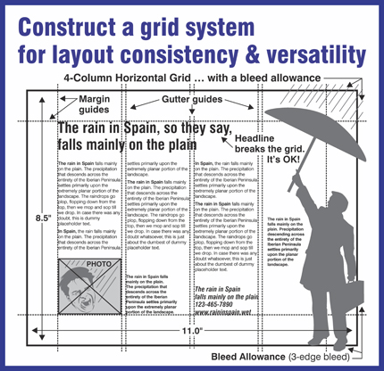
Precision with rulers, guidelines, and grids. That rulers are essential for precise alignment could not be more obvious. The wonderful feature in page-layout software is that you can specify that graphic elements "snap" to a ruling line, so that every element snapped to that line is perfectly aligned. When you build the layout, use the tools in your graphics software within a grid system of your own making that divides a page into vertical and horizontal sections. Establishing a basic grid --- margins, columns, and gutters --- is always the foundational step in building a layout from a thumbnail sketch design. The possible exception is the one-off, one-page flyer that you know will never be repeated. A grid can be as simple as just the margins that define a copy area, or as complex as a multi-column structure that is also divided horizontally for uniform photo alignment. At best, a modular grid structure holds everything in the layout together invisibly, imparting a consistent and harmonious look from panel-to-panel, page-to-page, or in the case of periodicals, from issue-to-issue. There is much more about grids included in The Cranky Typographer's Book of Major Annoyances: Helpful Graphics Tips for Do-It-Yourself Designers, by Reginald W. Bacon. (Yes, you can BUY the book here.)
Precision alignment. Precision alignment separates the work of real designers from the slapdash efforts of the amateur. No elements should be placed randomly on the page, but with a purpose. The human eye is acutely sensitive to alignment --- and misalignment. Therefore every element should align to some other element on the page, whether it is a art, photo, or type element, or merely the invisible line of a margin or column. Alignment of elements conveys a sense of order. The reader gets the message that an intelligent human really was "the boss" of the page. Consistency of alignment makes the reader feel secure in the surroundings of a page, publication, or website. At the same time, such consistency provides the underlying structure for any departures for interest-grabbing contrast. As ever, with discipline comes freedom, and from structure comes spontaneity. Different graphics software applications have slightly different ways to align horizontally, vertically, right, left, top, and bottom. Learn the particular logic of the alignment dialog box in your chosen software, and it will become a most frequently used tool.
Precision spacing. Just as with the alignment of type and graphic elements, the consistent and precise spacing of elements distinguishes the design craftsman from the freewheeling hack. Spacing encompasses relative closeness or distance, visual or intellectual proximity, the rhythm and repetition of spacing, and typographic spacing. Margins, gutters, and inter-line spacing of type, as well as the spacing between other graphic elements, influence the relative lightness or darkness of the page. The repetition of consistently spaced elements in a multi-page project --- subheads, bullet styles, ruling lines, ornaments, photos, even the spacing of white space itself --- contribute to the comfortable rhythm of a publication design, conveying a sense of unity.
Your attitude: The most important layout tool is not in the software. Building a layout from your design calls for the precision of an attentive craftsperson. Go ahead and let your work attain the exalted "flow state" when you are in the design stage and drawing your thumbnail sketch. But at the layout stage --- when you are harnessing your design in preparation for distribution to the unsuspecting public --- be a stickler for precision. Page layout is not brain surgery, but it does benefit from the attitude of the craftsman, and the finished presentation of your design will be better for it. If you don't have either the time, inclination, discipline, or constitution for craftsmanlike layout work, perhaps it is a good idea to turn your thumbnail design over to a pro for art production.
Practical layout considerations for print projects. For printing projects, you must consider the real-world of production. Even if your design looks great on your computer screen, remember that the final product must be produced in the real physical world. That means you must plan from the start for gripper-edge clearance, bleed-allowance, folding, trimming, and/or mailing. Huh? (Yes, you can BUY the book here.)
What follows are some practical tips
on achieving a layout that functions as a cohesive whole:
- Make sure the power of your design is retained in your layout.
- Remember that alignment is paramount for visual harmony.
- Make sure there is more space above a headline than below it.
- Don't enlarge type just to fill space.
- Make sure that the gutters are narrower than the margins.
- Remember that your layout is not a slop bucket to be filled.
- Don't enlarge a photo just to fill space. Have an idea.
- Remember, white space is your friend. Rely on your friend.
- Don't trap white space in the middle of a layout.
- Don't crowd a logo. Give it the respect it deserves.
- Join, link, or bond graphic elements when it makes sense.
- Separate or isolate graphic elements when it makes sense.
- Emphasize and de-emphasize elements when it makes sense.
- Use your noggin. Make sense in visually representing content.
- Don't be afraid to break the grid to add contrast.
- Avoid infection with hipatitis, or intoxication with fad effects.
- Don't be boring. Show some spark, even if you have to fake it.
(10) Prepare trouble-free production files.
Learn the basics of file preparation for printing. When you are satisfied with the finished layout of your project, your next do-it-yourself concern is getting your project into an industry-standard file format that can be interpreted by and output on professional graphics equipment, either for offset printing (ink on paper) or digital printing (toner on paper). Fortunately the world has seen the development and evolution of the Portable Document Format (PDF). The PDF format has become the industry standard for reliable professional imaging of graphics files. When a PDF file is prepared with care, the file will print as its creator/designer intended on almost any output device, regardless of the application or platform of origin. It is important to realize, however, that not all PDF files, and certainly not all PDF export and creation applications, are created equal. If you are going to prepare your own graphics production files, you need to know a tiny bit more than the three-letter acronym.
Follow print vendor specifications to the letter --- even if you think they (the specifications, that is) are backward. The inclusion of comprehensive digital file preparation specifications here would be an exercise in futility, as the pre-press requirements of today might be different by tomorrow morning. The best source for up-to-date file preparation guidelines is your print vendor. Follow your vendor's specifications exactly --- idiosyncratic or anachronistic as they might seem --- and your project will stand a fighting chance at streamlined, economical, and on-time production.
A file prep checklist that includes guidelines on measurements, photo resolution, line-art resolution, composite resolution, color, line-weight, typefaces & fonts, PDF creation, and file delivery, is included in The Cranky Typographer's Book of Major Annoyances: Helpful Graphics Tips for Do-It-Yourself Designers, by Reginald W. Bacon. (Yes, you can BUY the book here.)

What about file-prep for the Web? The principles of design still apply, as they still do on a printed page, but on the Web the designer must consider usability as well as readability. Regarding file preparation for the Web: The work with HTML coding, cascading stylesheets, and image preparation has evolved into a craft of its own, even though text-handling remains weak in comparison. Half of the rampant ugliness, stodginess, and reader-repulsive websites we all encounter is the result of every Tom, Dick, and Harriet signing up for push-button, one-size fits-all, template websites, but at the same time resolutely avoiding any knowledge of the underlying craft. Therefore, here is my advice: Design your website as a thumbnail sketch on paper, including distinctive header, repeating footer, and the individual pages. Arrive at a concise navigation menu --- preferably at the left, and vertical, like the contents of a (... drum-roll here) book. With your sketch close-at-hand, fire up your computer and build your header, polish your text, and prepare your photos to suit your individual page designs. If you are using an off-the-shelf template, be the boss of your template. It will be beneficial to learn the basics of hosting, servers, directories, uploading files, and HTML code so you can go under the hood and understand what's going on. If you are not willing to learn the basics of the craft, you can always stick to polishing the organizational plan and text content yourself, and then turn it over to a pro for implementation according to your design.
(Bonus Tip #11) Learn to love your stylebook.
Learn to love your stylebook. There's that word again: "Stylebook." Mastering your stylebook might be the quickest way to elevate the perceived quality of your graphics projects. Keep hard copies of your stylebook and dictionary within arm's reach. Use them until they are dog-eared, stained, and limp. Then buy new copies and start again. (What's a "stylebook"? See the sidebar at the right.)
Did you find these
10 FREE Tips
(Insights?) helpful?
If you found the above 10 FREE Graphics Tips (Insights?) to be helpful, just think if you could have your own entire book by the same author to consult and wear out until it's limp? The Cranky Typographer's Book of Major Annoyances: Helpful Graphics Tips for Do-It-Yourself Designers, by Reginald W. Bacon, is available for purchase on this website. You can BUY the book here. After soaking up all the information, you'll be able to go forth with your new insights on typography and design and help avert the decline of civilization!