The Cranky Typographer's Seminar:
Helpful Graphics Tips
for Do-It-Yourself Designers
is now RETIRED!
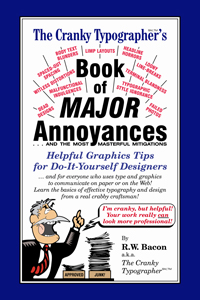
The Cranky Typographer's Helpful Graphics Tips for Do-It-Yourself Designers was a self-contained illustrated lecture presentation, with digitally-projected graphics illustrating the presenter's key points. The program's content was based on The Cranky Typographer's Book of Major Annoyances: Helpful Graphics Tips for Do-It-Yourself Designers, by veteran journalist, editor, publication designer, and typographer R.W. Bacon.

Topics included an introduction to typography, readability & legibility, body text, display text, spacing, typographic style, an introduction to design, typeface choice, working with photos, executing a layout, and digital file preparation. Each attendee received a copy of The Cranky Typographer's Book of Major Annoyances to reinforce the material covered in the presentation.

This seminar was designed for the do-it-yourself designer --- which means just about everyone with a computer on their desk. Today almost everyone in business is, at one time or another, called upon to be a "designer-by-default," but with little or no training in the craft. For many who never attended this seminar, the question still might be "What craft?" For others, who arrived at the notion that there must be more to this "desktop publishing" stuff than turning on the computer and typing, this seminar was an eye-opener leading to greater understanding and improved quality of work. Therefore this seminar was valuable to corporate advertising, marketing, & design departments; public relations & publicity departments; small business groups; non-profit volunteer organizations; professional associations; and indeed all who used type and image to communicate on paper or on the web.
The presenter's entertainingly cranky persona, combined with the humorous examples of malfunctional typography and design, ensured that attendees remained awake and alert --- and more importantly, that they could retain and use the information presented.
Helpful Graphics Tips for Do-It-Yourself Designers
is available in two formats:
The One-Hour Seminar. The compact one-hour program was a tightly-focused "crisis intervention," showing attendees how to identify and address the most commonly-seen typography, design, and graphics blunders. The quick-fixes imparted in this presentation --- along with follow-up study with The Cranky Typographer's Book of Major Annoyances --- aimed to lead attendees to produce printing and graphics projects of improved appearance and function.
The Three-Hour Seminar. The three-hour program extended beyond the "crisis intervention" to explore the principles of functional typography and design based on cognitive psychology and ongoing quantifiable readability studies. Attendees learned to identify the most commonly-seen blunders, but they also learned why these blunders impede communicative function. In addition to the quick-fixes, attendees of the longer program acquired a knowledge of readability and legibility, an understanding of functional design, an appreciation of layout craftsmanship, and an awareness of the many other considerations that go into a thoroughly professional project. For follow-up study, attendees received a copy of The Cranky Typographer's Book of Major Annoyances.

